For this next section of the project I will be analysing a three different CD covers in preparation for the production of my ancillary tasks. I have decided to analyse three covers from three bands who are in similar genres of Punk rock.

This Album cover instantly caught my eye due to the creative font they have used. From this, I believe that this will be one of the major factors our group will have to consider when producing one of our own. One other reason for why this album is successful is because of the colours which were chosen in the design of the cover.

Underclass Hero is Sum 41's fourth studio album and the only record that was released with only three members in the band. The album cover features a photo which would really be singer Deryck Whibley himself spitting something. The Sum 41 band name wrote in pink doesn't really fit within the theme of punk rock but it makes the name of the band stand out on the cover as everything else on the cover is in black and white.

Poster AnalysisAnother part of our ancillary tasks is to create a magazine advert or poster advertising the release of the CD. I have gathered a few existing posters to analyse and draw inspiration from. Each poster is by an artist to similar to the one we will be creating
My chemical Romance (2005)

This poster was released in 2005 to help promote My Chemical Romance new album. The long shot in this post incorporates the whole band and their public image. what really stands out about this particular poster is the dark purple patterned background which gives the poster this mysterious or. Also which gives the poster good effect is that the band members skin tone has been made more pale which makes them stand out.
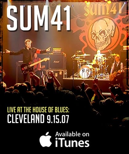
This is SUM 41 magazine poster insert which has featured in many punk rock magazines such as kerrang. The actual shot its self is one taken from a live performance which is advertising their next live performance.Its is also promoting the release of their song on Itunes. The image itself
is very simple and basic and its doesn't seem to have any special editing effects apart from the text.

This poster is off blink 182 which came as a free insert in one of their albums. One thing that caught my eye about the poster is the special effects which have been incorporated in the image, for example, the band has been put into black and white which makes them stand out from the graffiti background which i think works well together.
The next stepOur group’s next steps are to start to organise the photo shoot to gather a variety of photos which we can then start to create our groups magazine poster and album digipack. For that process to be successful we will need the correct equipment, which we will organise before hand to stick to our group’s strict time schedule. We must also consider the costumes we will be wearing in the photo shoot, as this will be a vital factor as we must appeal to our target audience.
After we have collected our photos, we will then start to narrow down our photos to a fine selection of which we feel are the best.
Once we have narrowed down the selection, we will the create 3 posters and 3 album covers which we will then conduct a questionnaire on our target audience to see which poster and album cover gets the best response, which we will then carry that chosen one forward.
Here we have our test shots and final shots which we will be taking forward
That short power point just shows the array of photos which we had taken. We then went in to some analysis to explain why we carried those particular photos forward.
We are now going to create 3 magazine posters and album covers to then ask our target audience what they feel is the best one.
Our group poster final 3

Our groups album cover final 3

Questionnaire
1. What Poster do you think best suits the genre?
Poster 1- 16 poster 2-1 poster 3- 3
2. What CD cover do you think best suits the genre?
CD 1- 15 CD 2- 3 CD 3- 2
Here are a couple of opinions why the most popular one was chosen by our target audience
• The pose represents the characters well in the music video
• The choice of clothing in the shots
• The bright colours which represents fun and excitement
Post Questionnaire
<div style="width:425px" id="__ss_12336187"> <strong style="display:block;margin:12px 0 4px"><a href="http://www.slideshare.net/matt1234mh/post-questionnaire-pie-chart-anaylsis" title="Post questionnaire pie chart anaylsis" target="_blank">Post questionnaire pie chart anaylsis</a></strong> <iframe src="http://www.slideshare.net/slideshow/embed_code/12336187" width="425" height="355" frameborder="0" marginwidth="0" marginheight="0" scrolling="no"></iframe> <div style="padding:5px 0 12px"> View more <a href="http://www.slideshare.net/thecroaker/death-by-powerpoint" target="_blank">PowerPoint</a> from <a href="http://www.slideshare.net/matt1234mh" target="_blank">matt1234mh</a> </div> </div>http://www.slideshare.net/matt1234mh/post-questionnaire-pie-chart-anaylsis